Da Good Vibes
Objective
Da Good Vibes application would house more information, connect with it’s followers, and allow customers to make reservations. The site will be easy to navigate through and viewers will enjoy their food experience.
Timeframe: Eleven days
Deliverables: Research, information architecture, interaction design, low/high fidelity wireframes, usability testing, and user interface design
Software: Sketch, Invision, Illustrator, Photoshop, Optimal Survey
ROLES
UX Designer: prototyped experiences at low and high fidelity through concept sketches, wireframes, and high fidelity interactive prototypes.
UX Researcher: conducted field observations, contextual inquires, interviews, and usability tests with targeted users.
Client-Facing Communication: research findings and designs through considerate slide deck designs. Discussed with peers to define success parameters and share resources/ideas.
RESEARCH
Methodology
Secondary Research: Review restaurants and catering service sites. What are customer concerns while making reservations or placing orders. What worked and didn’t. Discover the “DO’s” and “DON’T’s”.
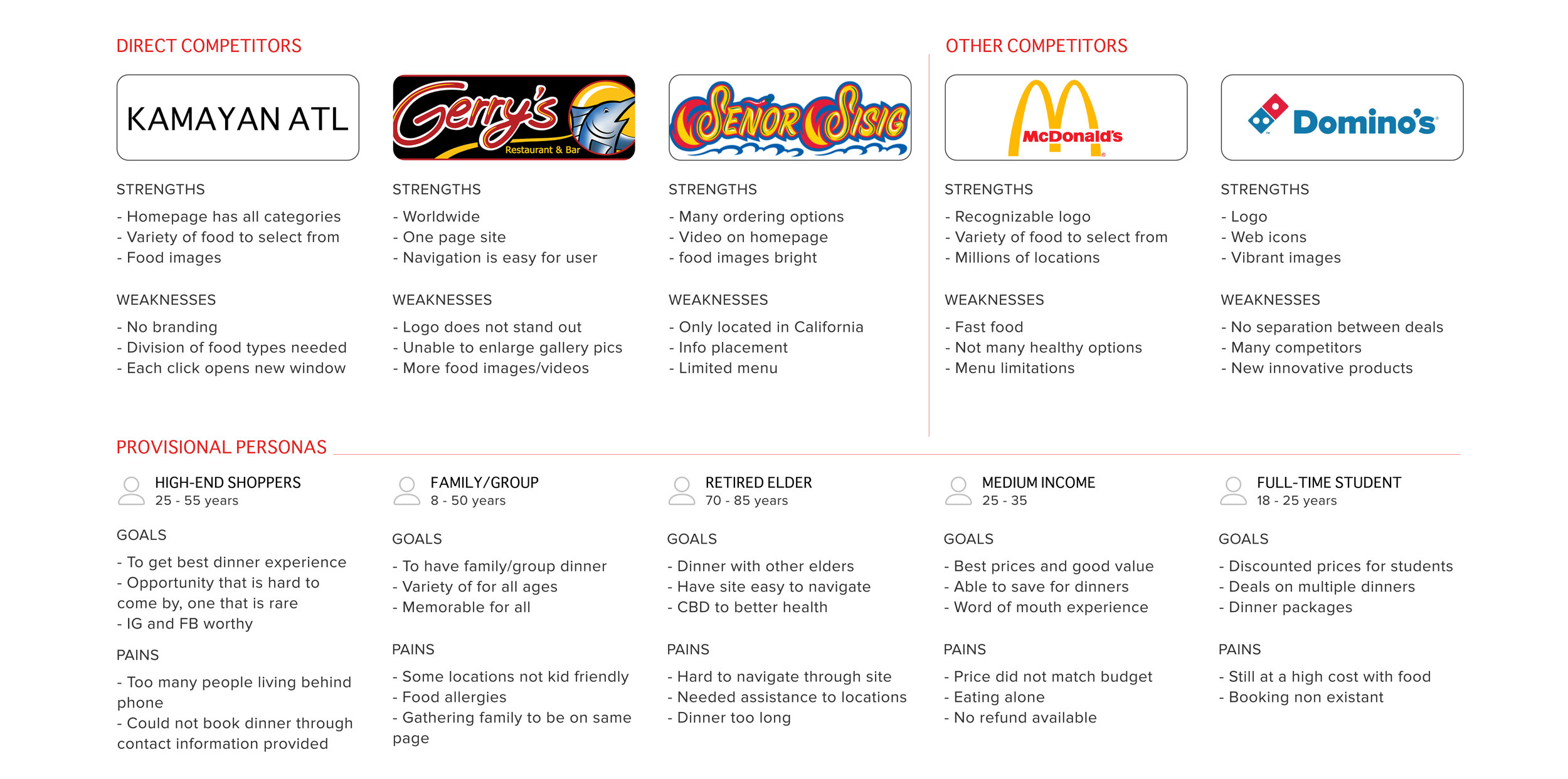
Competitive Analysis: Review competitors and what is working for their sites. What keeps customers coming back. What features can be incorporated into a pop up dinner site. Which colors, typefaces, images, videos are drawing in users in?
Findings
While searching for different companies in common businesses, I found that each had their own way of approaching the design and experience of their site. Some included features that would draw the user in and keep them engaged. While others relied on loyal followers and had zero interest in making their visual appearance appealing.
INFORMATION ARCHITECTURE
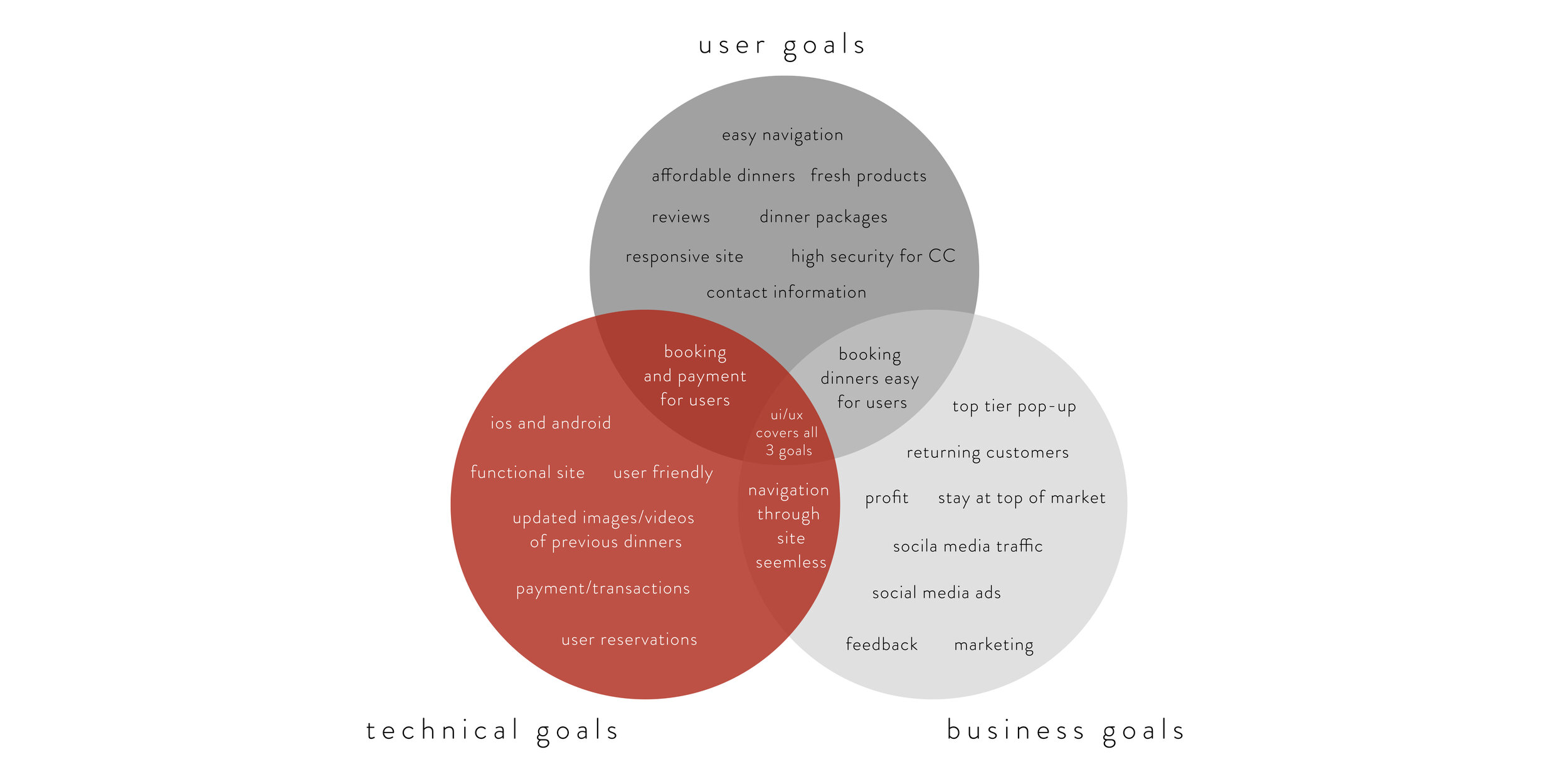
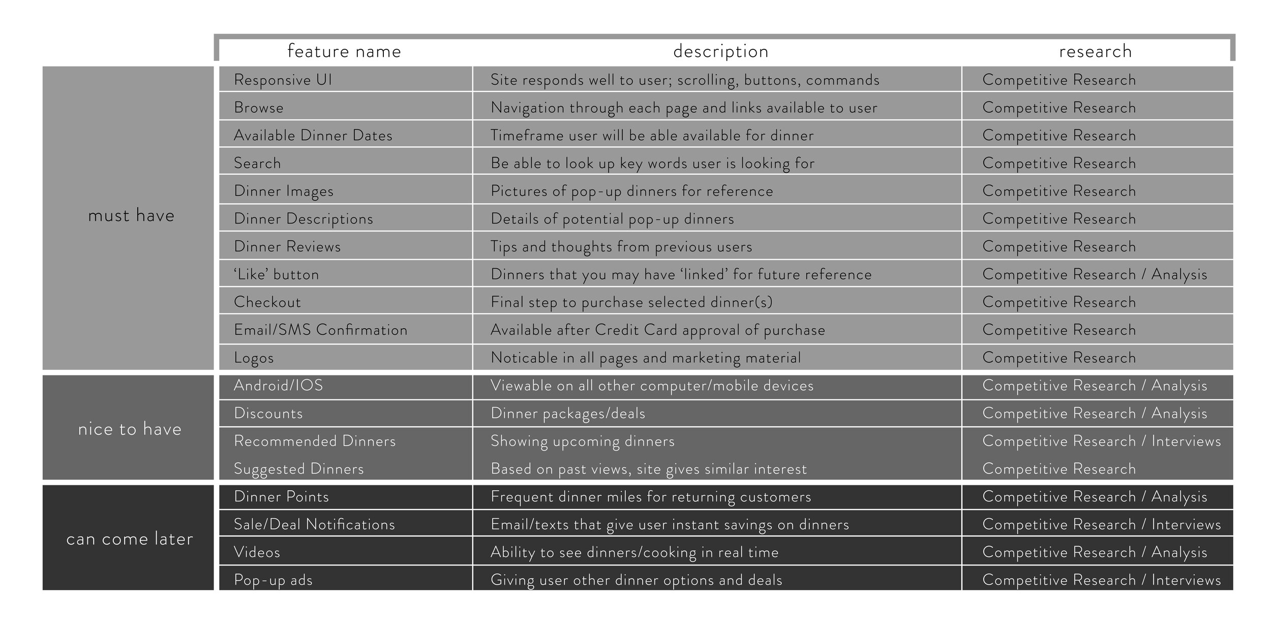
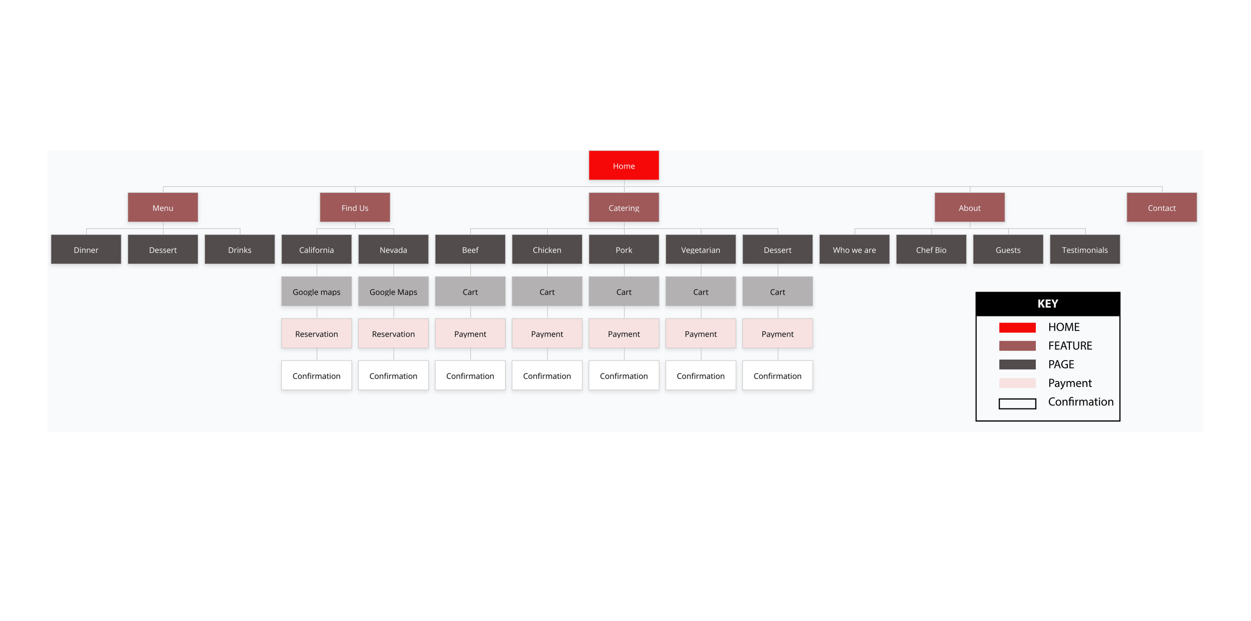
Interviews and surveys were conducted to get a better sense of where people were spending their money. This would help with who to target and how to appeal to the crowd.
Findings
After receiving the data from the survey and 1:1 interviews, I found that about 90% have never been to a pop-up dinner. But all participants shown interest in attending this type of food experience. Now the question is: how to reach out to potential customers and educate them about this option.
INTERACTION DESIGN
UI Product Requirements
Pages to Design
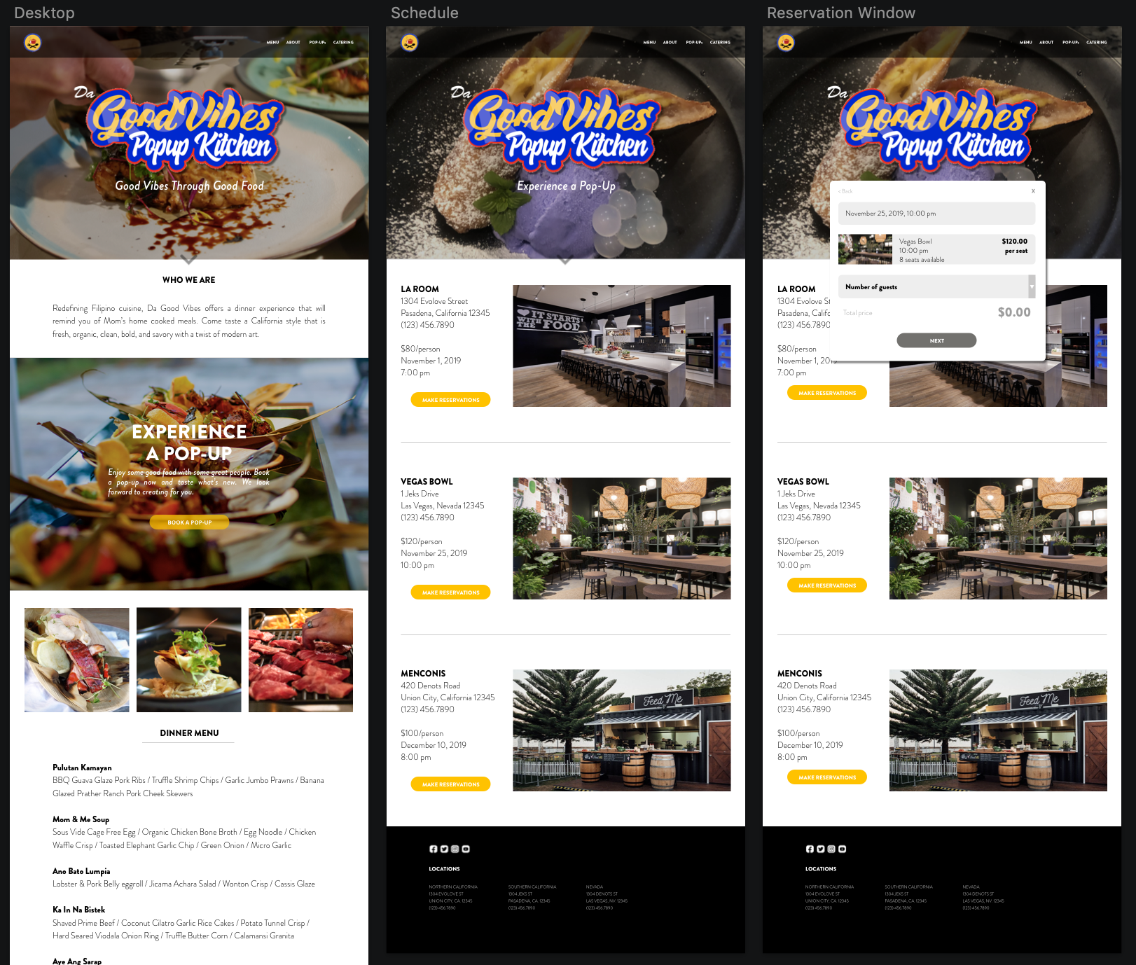
Homepage: main navigation / introduction / Chef information / footer
Category page: menu / about / contact / calendar / catering
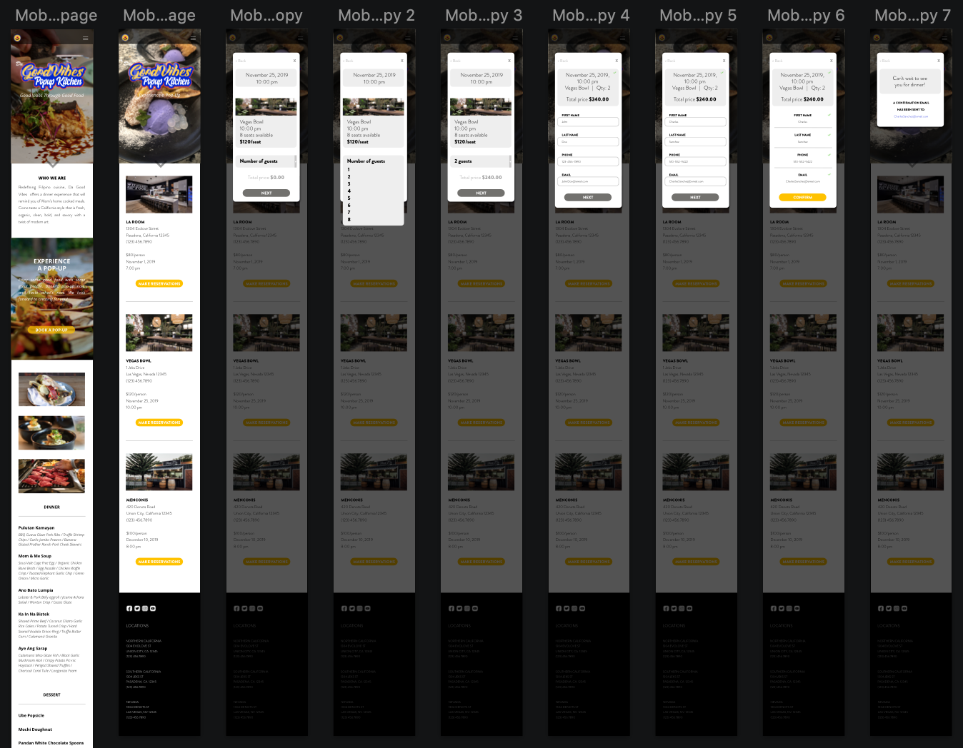
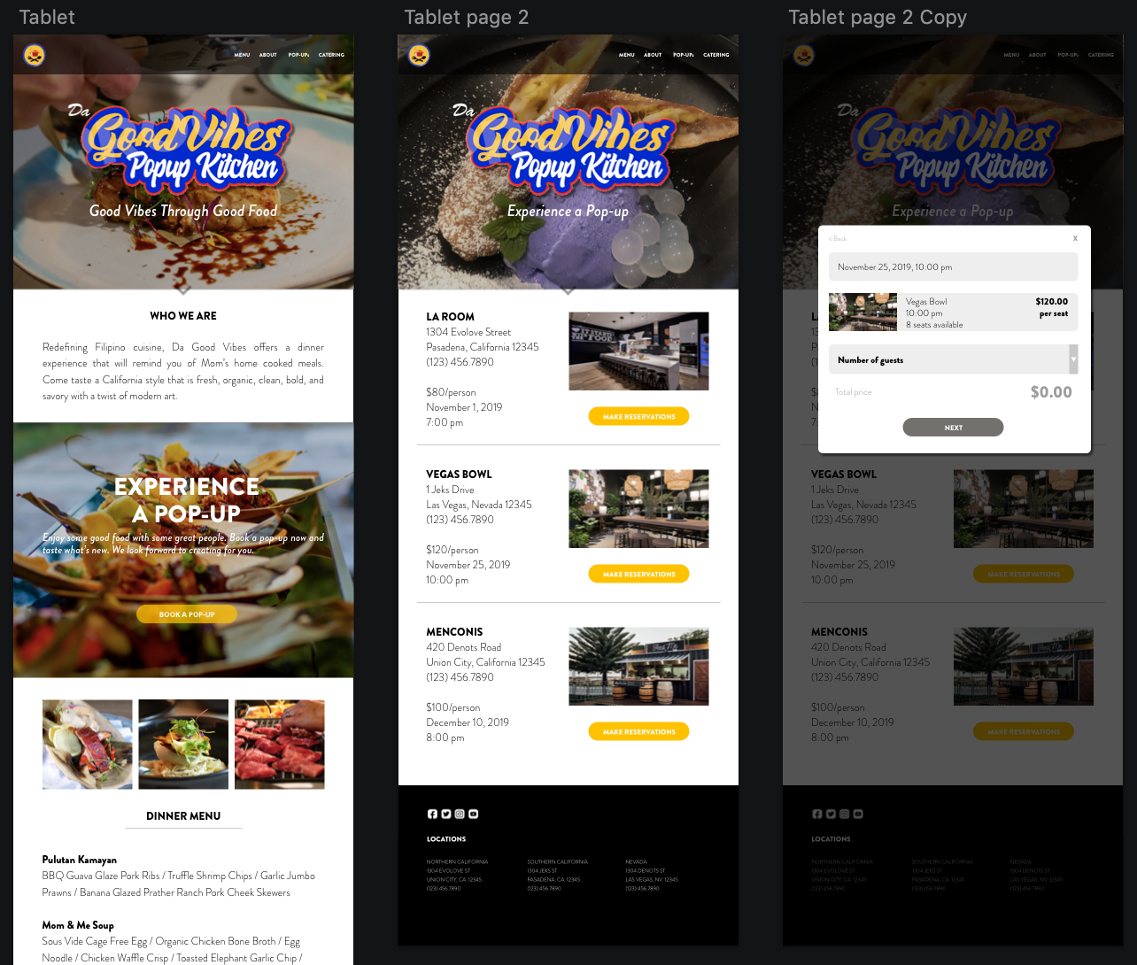
Booking/Reservation page: location / day / time / cost / pax / confirmation email
High Level Requirement
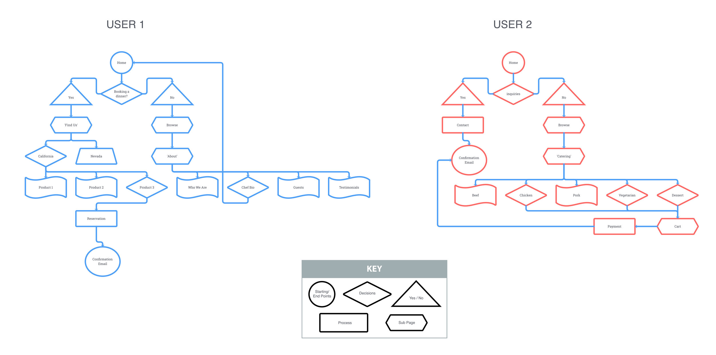
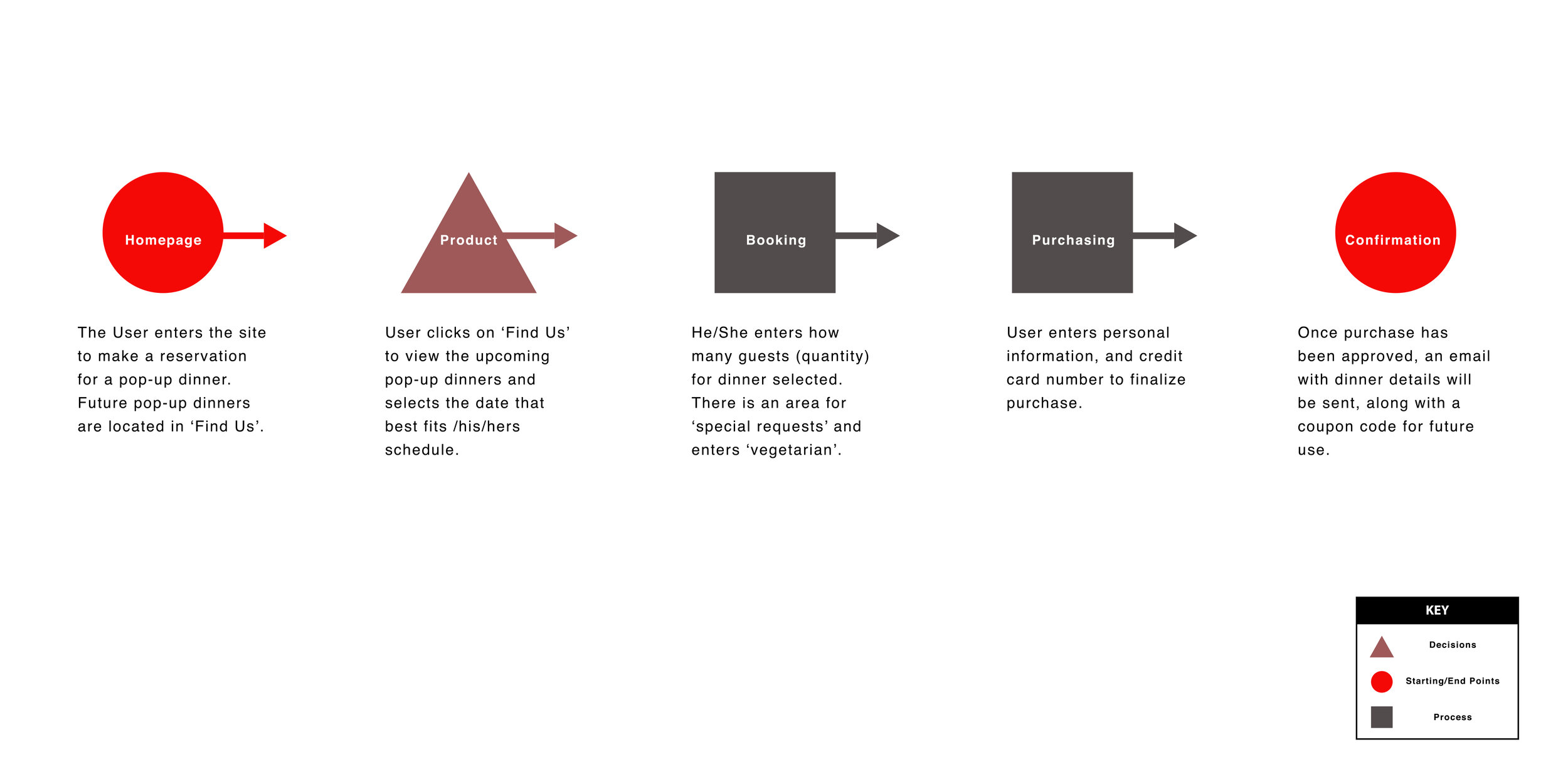
An interface that allows the user to navigate through to find their dinner location easily. The user should also have no issues making a reservation through the site.
Findings
While creating the wireframe for the Desktop and comparing drafts to other competitors, the common element between restaurants were large images. Images that covered the screen kept you engaged and more curious to scroll or click. The wireframes designed accomplishes this. Large images for each subject gives the user a better idea of their location within the site.
USABILITY TESTING
Test Objectives
Does the User feel at ease with the color scheme and design of homepage
Branding communicate well to User?
Homepage buttons clear to User and what the next step should be
Typefaces selected are clear and legible to User
Clickable area for forms are easily located
Any confusing or unclear elements of design
Test Methodology
Remote testing: InVision
Subjects will receive link to UI design.
Open Ended comments
Task
You are interested in booking a pop-up dinner and would like to make a reservation through Da Good Vibes. You are interested in the Vegas Bowl location. Your task is to complete a reservation at the location of interest and arrive at the ‘Confirmation’ window.
Goals
• Are the Users able to navigate through without confusion
• Are the buttons clear and is User able to identify them on each page immediately
• How any clicks does it take for the User to reach Task goal (8 clicks)
Test Completion Rate
• Rate of completion should be 100%. I designed the interface to replicate and resemble a restaurant site. Navigation and experience should feel familiar.
Error Free Rate
• With limited buttons available, the User should be able to identify the task of each button by its location and how it is labeled. There should be no errors when booking.
Findings
Overall, each of the participants enjoyed the experience. The vibrant colors and images kept them engaged and searching for more. Questions asked during testing: ‘Will you have more images for users to review?’, ‘Are there any videos available of chefs cooking?’.
As far as the number of clicks to complete the task, 1/4 went through it with the least amount of clicks (8). All others clicked on the hamburger menu for an easier path to make a reservation. This just shows that the usability testing should also include the fastest way.
USER INTERFACE DESIGN
UI kit
What I Learned
Da Good Vibes started off with many ideas for its branding. Researching helped develop a clear vision through logos, colors, content, and images. The surveys conducted seemed incomplete because the lack of experience participants had with pop-up dinners. It has taught me that I can approach every issue from a different angle.
There was one thing I would have changed during the interview process. A discussion with owners of multiple restaurants about the hurdles they had to jump. This would have given me a better point of view.
Adding more content to help market Da Good Vibe’s brand would be my next step to improve what I have initiated. People need to be educated about what pop-up restaurants provide and how much fun they can have with a new experience!


