Grab

Objective
Adding a feature to the existing design to work in the product without disturbing the look, feel, and experience it already provides. The goal is to still keep the users engaged and informed about the new details.
Timeframe: Twelve days
Deliverables: Research, information architecture, interaction design, low/high fidelity wireframes, usability testing, and user interface design
Software: Sketch, Invision, Illustrator, Photoshop, Optimal Survey

ROLES
UX Designer: prototyped experiences at low and high fidelity through concept sketches, wireframes, and high fidelity interactive prototypes.
UX Researcher: conducted field observations, contextual inquires, interviews, and usability tests with targeted users.
Client-Facing Communication: research findings and designs through considerate slide deck designs. Discussed with peers to define success parameters and share resources/ideas.
RESEARCH
Methodology
1:1 Research: Schedule interviews with participants in each age range that I am targeting. Provide questions to each group to find what is the common need and expectation.
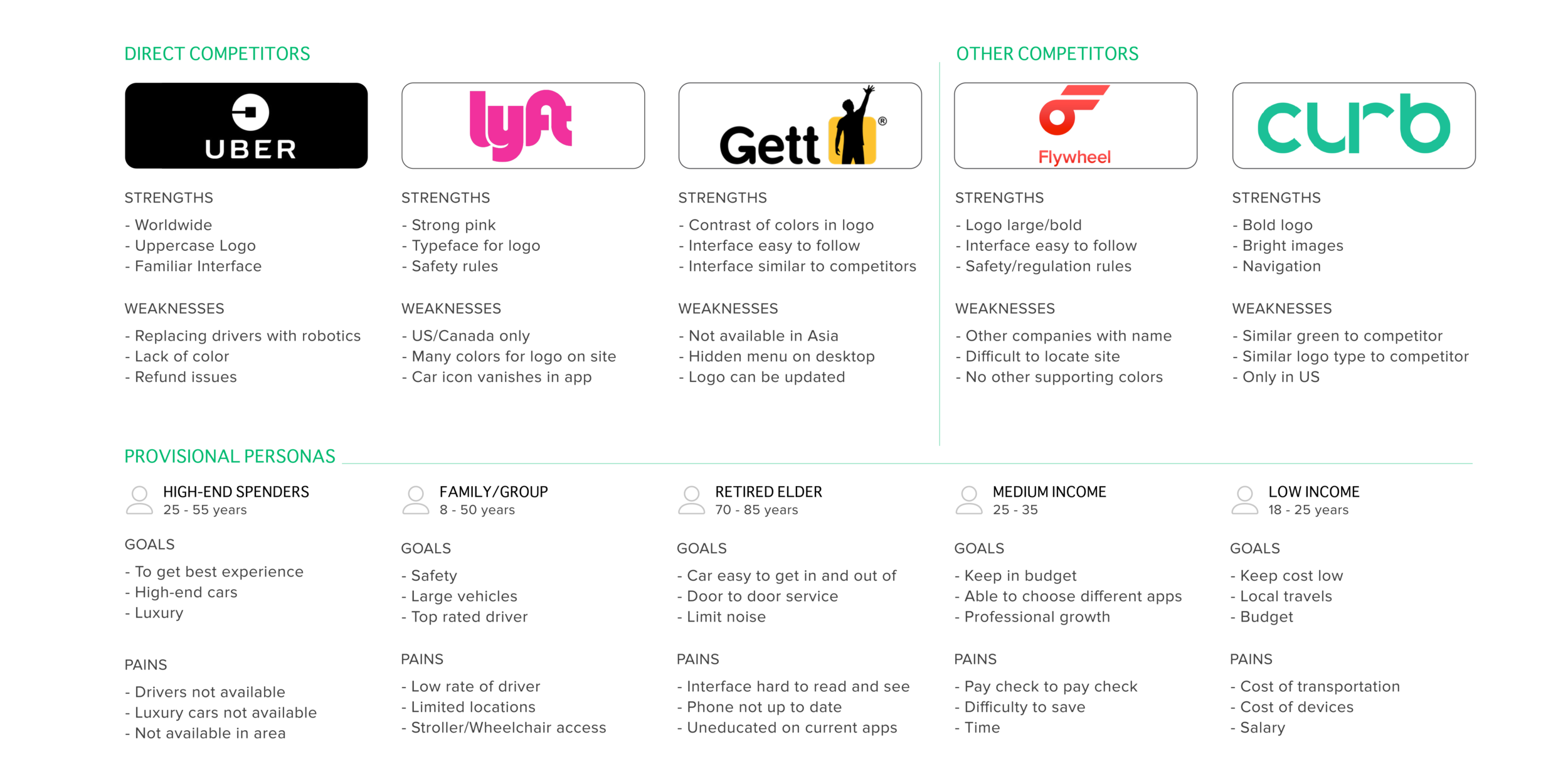
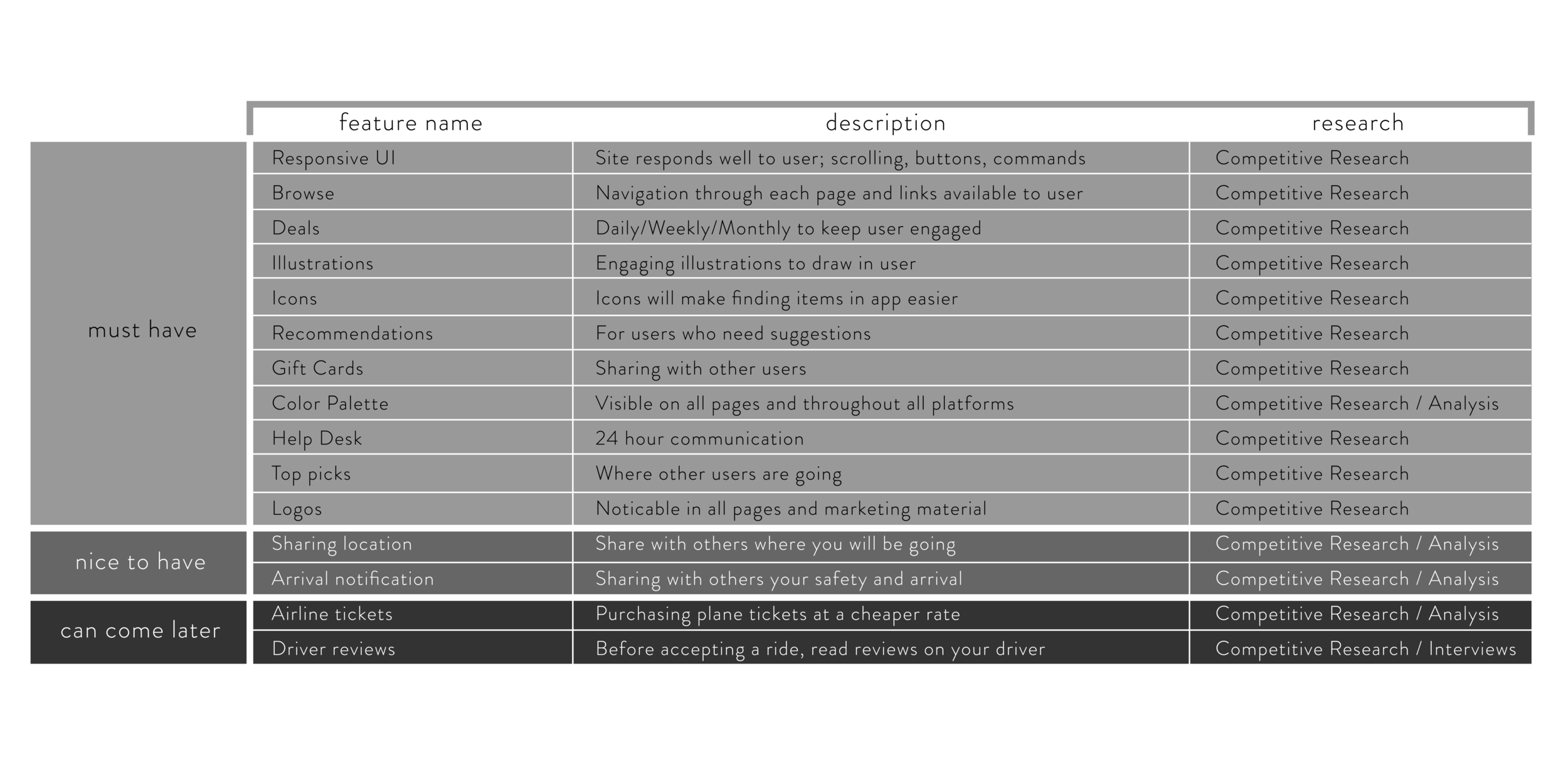
Competitive Analysis: Review other taxi services and their applications. What are the most common features and what works for their users. What isn’t working for each of these products and how can they be revised?
Findings
100% of the people interviewed have a vehicle application downloaded onto their devices. It gives them comfort knowing that they are just a button away from any destination. Majority of users interviewed have experience with Uber, with only a few having knowledge of Grab. This would be a great opportunity to find out what users expect and what can be improved as a passenger.
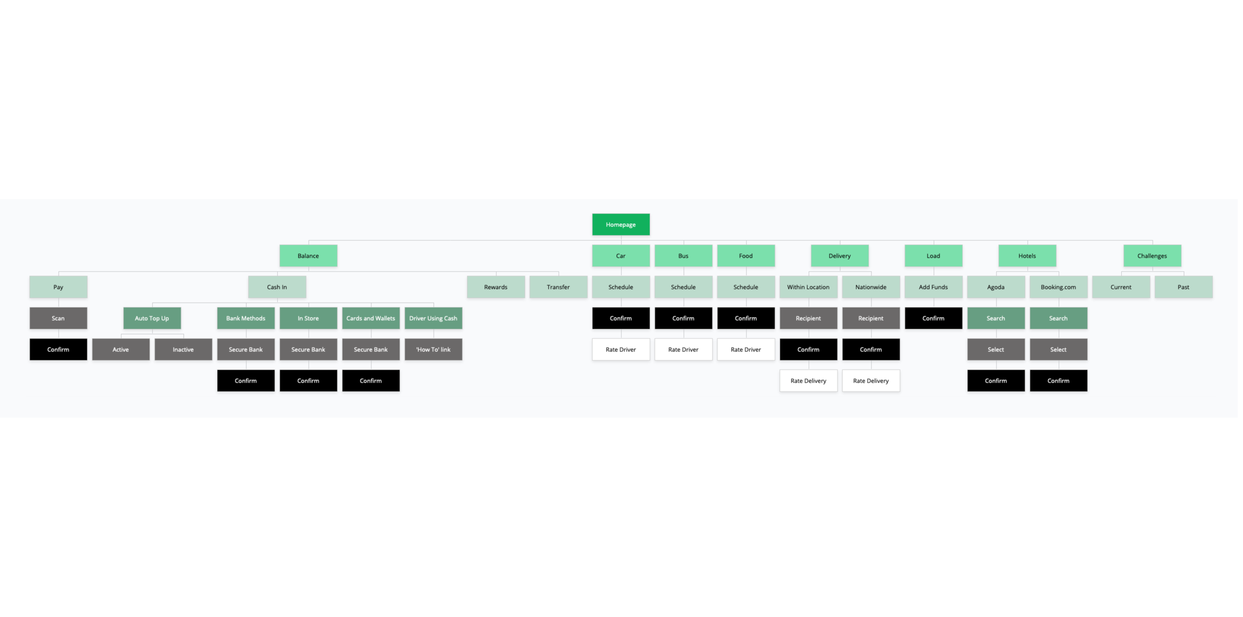
INFORMATION ARCHITECTURE
Surveys and 1:1 interviews were conducted to help understand what the user needs and expects out of a taxi service. Questions were focused on the types of public transportation being used, how often taxi services are called, and what any improvements users would like to be made in transportation applications. But receiving two sides of the story helps with understanding what is truly needed in a product. Conducting 1:1 interviews with a Grab driver and a Passenger can provide answers on both ends.

Grab Driver
As soon as the driver pulled up, I noticed there was some frustration on his side. His application had given him a longer route to pick up the passenger. Immediately I asked what can be done to prevent this. The driver suggested that the product should provide multiple routes as options to pick up passengers. It would allow him to pick the best path for himself.

Grab Passenger
On the other end, users experience many things on the application side. During my interviewing with a passenger, I asked what would they like to add/remove/improve in the product. A handful of ideas about improving the product came up, but one stood out. Combining Grab’s services with Google Map’s features. Users found discomfort jumping back and forth searching for a desired location and requesting transportation.
Findings
Combing through the product to see if there were any other features that needed an upgrade as well, but could not locate anything. Once 1:1 interviews began, ideas from other user’s perspectives became more clear. There are many other possible features to add to the product on both the Driver’s side and the Customer’s.
INTERACTION DESIGN
UI Product Requirements
Pages to Design
Homepage: Features, Icons, Mobile banners
Booking page: Map, Pick up location, Destination
Google Maps with Grab link page: Map, Restaurants, Grab icon
Mobile banners: Large and small to be placed in application
High Level Requirement
Integrating the new feature into the product without disturbing the navigation and flow of the application
User Task
User starts at the Grab homepage to book a ride for lunch. They have yet to make a decision on where to eat, but would like suggestions. The new feature in Grab will help the user find multiple options by using the new icons presented. The icons are as follows: Food, Shopping, Landmarks, and What’s New. Once location is selected, the user clicks on the Grab icon to book the ride.


Findings
While creating the user flow and transferring the outline to a low fidelity sketch, I already came across some issues that may confuse the user. Searching for a location in Google Maps and back to Grab, would lose users. The idea is to add a feature to the existing product without pushing the user away. On the next version, it will be smarter and more fluid if Google Maps became part of Grab’s experience.
USABILITY TESTING
Test Objectives
Does the User feel at ease with the navigation and design of homepage
Branding communicate well to User?
Are the buttons clear to User and what the next step should be
Typefaces selected are clear and legible to User
Clickable area for forms are easily located
Any confusing or unclear elements of design
Test Methodology
Remote testing: InVision
Subjects will receive link to UI design.
Open Ended comments
Task
Book a ride to a restaurant using Grab’s new features/icons located in the car booking page. Search for your destination using the food icon to find the nearest Jollibee restaurant near you. Once located, book a ride with Grab.

Test Goals
• Users able to navigate through both products without confusion
• Buttons clear and is User able to identify them on page immediately
• How any clicks does it take for the User to reach Task goal (6 clicks)
Test Completion Rate
- Rate of completion should be 100%. Interface of both products should feel familiar and similar to sites visited by the user.
Error Free Rate
- With limited buttons available, the User should be able to identify the task of each button by its location and how it is labeled. There should be no errors when completing the task.
100% of users completed the task given with no issues. Half were able to reach the end goal without any confusions because of their experience with the product. The other participants came across some issues because the product was new and were not familiar with the interface. While observing participants, I found that integrating the feature saved time and reduced confusion. It also kept the user in the product, rather than having them explore other options.
USER INTERFACE DESIGN


UI kit

What I Learned
I wanted to explore how the user searches while using a taxi service application. When I sent the high-fidelity wireframe out to participants, users agreed that the ability to search for destinations would help.
But looking back there are many other ways I could have approached this case study. Uber users have a long history of using this type of service, and researching/interviewing more on that subject would have been useful for this study.
Moving forward, I will be exploring ways where you can give a suggested route to the driver. Could this lead to a cheaper rate/ride? Would this cause confusion with the driver? Only research can determine if it would help.